
title: Scatter plotting in python link: https://claireduvallet.wordpress.com/2017/06/21/scatter-plotting-in-python/ author: cduvallet description: post_id: 1131 created: 2017/06/21 03:08:30 created_gmt: 2017/06/21 03:08:30 comment_status: open post_name: scatter-plotting-in-python status: publish post_type: post
Scatter plotting in python
In the past year or so, I’ve become a full-fledged tidy data convert. I use pandas and seaborn for almost everything that I do, and any time I figure out a new cool groupby trick I feel like I’ve PhD-leveled up. That’s why it’s so frustrating that I still can’t find a good way to plot categorical scatterplots. I want:
- an easy way to plot a scatterplot where the points are colored according to an associated categorical variable.
- to be able to manipulate this plot on the Axes object level (so that I can place it wherever I want, and so I can modify parameters after making the plot)
- to be flexible with respect to my categorical variables (i.e. I don’t want to hard-code any of them in, so that the plot is automatically updated if the number/identities of my categories change)
- the code to be elegant and in the spirit of tidy data!
Seaborn
As a tidy data convert, my first go-to is almost always seaborn. Seaborn is great and I highly encourage everyone plotting in Python to get used to it. Functions for different types of plots all take basically the same inputs, so it’s trivial to change your barplot into a boxplot and so on. It’s also really easy to slice and dice your data in different ways: you just tell seaborn which column is the x axis, y axis, color, etc. It’s also really nice because you can usually make a nice-looking plot with one line of code! That said, every time I want to plot a scatterplot with points colored according to a categorical variable, I furiously google and StackOverflow and end up with the following options that might be able to do what I want. [code lang=python] import matplotlib.pyplot as plt import pandas as pd import seaborn as sns %matplotlib inline sns.set_style(‘white’) df = sns.load_dataset(‘iris’) df.head() [/code]
sepal_length sepal_width petal_length petal_width species
0 5.1 3.5 1.4 0.2 setosa
1 4.9 3.0 1.4 0.2 setosa
2 4.7 3.2 1.3 0.2 setosa
3 4.6 3.1 1.5 0.2 setosa
4 5.0 3.6 1.4 0.2 setosa
lmplot
lmplot seems like the obvious first choice, since it makes the plot I want. lmplot is a wrapper around regplot, which makes a scatter plot of x vs y-variables, and fits a regression to the relationship. When you turn off the regression, it’s just a scatterplot. lmlplot wraps this functionality into a FacetGrid so that you can split your data according to a hue variable (and do the regression on each category separately). However, it makes and returns a new FacetGrid instance, and it’s unclear to me how to interact with the underlying Axes object. Also, there isn’t any way to pass an existing Axes instance to the function, and so I can’t put this plot on an existing figure (e.g. that I made using plt.subplots() or with GridSpec). I’m forced to have this be its own new stand-alone figure. [code lang=python] sns.lmplot(data=df, x=’sepal_length’, y=’sepal_width’, hue=’species’, fit_reg=False) [/code]  [code lang=python] fig, ax = plt.subplots() sns.lmplot(data=df, x=’sepal_length’, y=’sepal_width’, hue=’species’, fit_reg=False, ax=ax) [/code] [code lang=text] -————————————————————————– TypeError Traceback (most recent call last) in () 1 fig, ax = plt.subplots() -—> 2 sns.lmplot(data=df, x=’sepal_length’, y=’sepal_width’, hue=’species’, fit_reg=False, ax=ax) TypeError: lmplot() got an unexpected keyword argument ‘ax’ [/code]
pointplot
This is another option I always forget about until I’m well into the rabbit hole (surprisingly, it doesn’t come up often in my google searches). That said, maybe the reason it doesn’t come up is that it actually doesn’t do what I want. I’m not sure how to use this function to plot the individual points. This plotting function aggregates the points in each category with an estimator, and the documentation even makes this explicit:
It is important to keep in mind that a point plot shows only the mean (or other estimator) value
There go all my hopes and dreams… [code lang=python] ax = sns.pointplot(data=df, x=’sepal_length’, y=’sepal_width’, hue=’species’) ax.set_xticklabels(ax.get_xticklabels(), rotation=45) fig.tight_layout() [/code]  Another really important caveat with this function is that it treats the x-axis as _categorical values - I’ve been tripped up by this before! This can really mess up your interpretation of the graph, if you’re expecting to look for a relationship between continuous x and y-values. This is definitely not the right kind of plot for this. In the following plot, for example, look at how the x-axis jumps from 0.6 to 1.0. Ruh roh! [code lang=python] ax = sns.pointplot(data=df, x=’petal_width’, y=’sepal_width’, hue=’species’) ax.set_xticklabels(ax.get_xticklabels(), rotation=45) fig.tight_layout() [/code] 
FacetGrid
Finally, we can go old-school FacetGrid + plt.scatter (I don’t know why this registers are “old-school” in my mind but it does). Again, however, this returns a FacetGrid that you can’t easily manipulate or move around. Womp womp. [code lang=python] g = sns.FacetGrid(data=df, hue=’species’) g.map(plt.scatter, ‘sepal_length’, ‘sepal_width’) [/code] 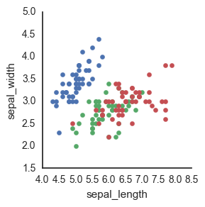 Because seaborn is a statistical plotting package, it tends to focus on making doing fancy things easier (while often times making doing easy things fancier…) This is one of those instances where it’s not totally clear to me how to just plot the raw data.
ggplot
Okay fine maybe seaborn is too fancy to actually do this simple thing. Obviously what I want is to recapitulate R’s ggplot functionality so why not use Python’s own ggplot? Answer: honestly, because it’s a bit too early in its development and I find the lack of documentation frustrating. For example, I can’t seem to find whether you pass in an Axis instance to the ggplot call somewhere to specify where to make the plot. [code lang=python] import ggplot as gg gg.ggplot(df, gg.aes(x=’sepal_length’, y=’sepal_width’, color=’species’)) + gg.geom_point() [/code]